If there’s one thing to talk about that will make anyone sound like a toss pot, it’s light. Just bringing up the subject makes you a suspected pompous arse, and the only words to describe its various qualities are effeminate at best. Since starting college twenty years ago I’ve only ever heard a mumbled “…hmm, yeah – and the light’s pretty nice” as the beginning and end of any photographic discussion between two men on the subject. So, with that uncomfortable truth exposed and accepted, let’s get on – I’ll try to keep it practical.
I’ve always liked how different lighting suggests various intentions. If you stripped a magazine of all the words and graphics and just left photographs behind, we’d still be able to tell which are the adverts and which are editorial. That’s partly because we’ve been become familiar with glamour lighting being used to make a selling message stronger, and traditionally that style takes more time and expense to produce.
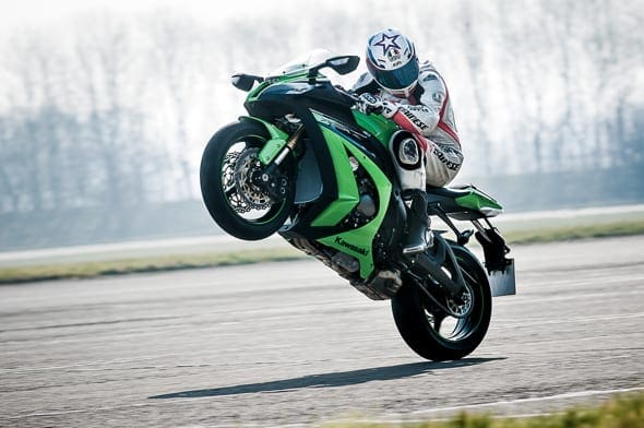
Commercial motorcycle action imagery has always puzzled me a bit. I could tell it looked different, but apart from faked-up studio style pictures I didn’t really get how that difference was achieved. Then at this year’s first visit to Bruntingthorpe I tried something without knowing that it would definitely work. I know – crazy right? To be honest all I did was to also shoot the return run during a wheelie session, even though it was literally straight into the sun, when usually I wouldn’t have bothered.
So what’s going on here? Two things: massive under-exposure, and what I thought would be shot-ruining flare. It’s like a veil over the entire frame, and it gives detail back to the areas in shadow – which is basically all of it. But just because everything is in shadow, that doesn’t mean our ten-r mounted editor isn’t lit. He is – by really nice light that’s coming back onto him from the concrete between us and him, and a rim or halo effect from the bright sky around him. All I had to do was spend five minutes in Lightroom adding a few brush strokes to reveal the effects of a lighting style that we used to spend ages setting up in a studio. That’s the expensive commercial drama style, and it turned out it was there all the time – I just had to know where to find it, or in this case, find it by accident.
What’s nice about it? Partly it’s the novelty of seeing things in a way you can’t normally see them. Textures are revealed, shiny contrasts with matt, the real shape of things or the unreal improvement of the shape of things. But that’s the traditional use of the commercial image – to make the object appeal to you. The best bit for me is that glamour lighting on worn leathers and fly-spattered helmet is against what’s expected, so we’re supposed to see it as deliberate, and take it as part of a story.
So having managed to not use any flowery adjectives, that’s discussion over – any genuine accusations of pompous arse related toss-pottery may now resume.
Jonny Gawler – Moto Photo


